
Project:
FRONTLINE Website Redesign
In 2015, I worked on the redesign of the FRONTLINE website at WGBH Digital. FRONTLINE is the PBS investigative journalism and documentary series. The website has over 200 full films, text articles and interactive features.
I was the lead designer on the project, responsible for the visual design and user experience. Our goals were these: Give the site a visual refresh so it falls more in line with a fresh vision for the FRONTLINE brand. Make it responsive, of course, and optimize the reading and watching experience for mobile. And design to accommodate some unique editorial and publishing processes.
Early on our team worked together to gather user research based on site analytics and a user survey of the existing FRONTLINE audience. We then created user personas and scenarios so we could start to craft our initial solutions to target these specific audiences and use cases. For example, we wanted to target a younger audience coming to our site from facebook that was unfamiliar with FRONTLINE. How could we engage them with a single piece of reporting and then introduce them to a bigger archive of investigative journalism videos and articles? It’s scenarios like these that helped shape our initial process and keep the design solutions focused.
Concept
The FRONTLINE editorial team had specific needs around publishing content. They needed article templates that could accommodate both shorter, quick-hit stories and longer investigative pieces. They wanted to curate and bundle content around film topics. And they had a sometimes infrequent publishing schedule, different from the day-to-day churn of a daily news site.
My approach: sketch out a loose system of flexible components based on these needs. Our team could then work together on the details of the components and then assemble them into page templates. All the pages on the site would simply be different configurations of components pulled from the same library.

We cut these paper component sketches out individually and started assembling them into pages. This formed the basis of the site and helped the team get on board with the idea of a website as a system of components and templates.
Alongside this work our team began a phase of content strategy that started with an inventory of the existing types of content. This allowed us to start making decisions around what content types to prioritize for the redesign and what could be left behind in a legacy format.
Wireframes and Prototypes
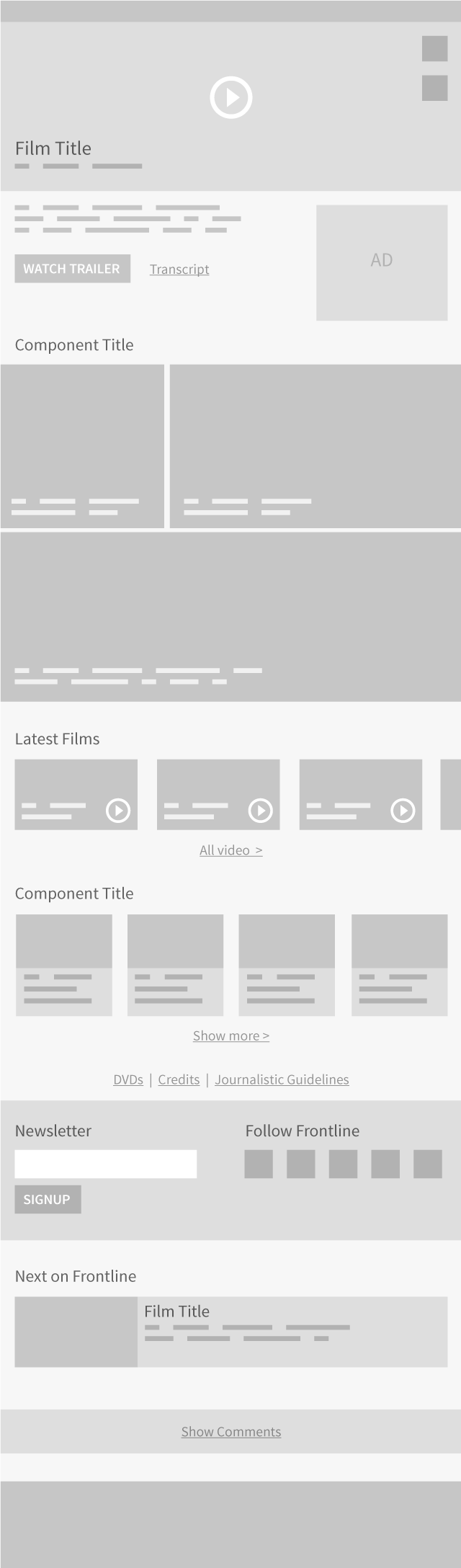
The success of the paper components led me to propose a similarly flexible and collaborative method for wireframing. I created rough, responsive html wireframes of individual components. I then could easily assemble the components together in different ways to come up with template variations. All of these initial components and templates were immediately viewable on the devices of team members. We were judging these early design decisions in the right context, the same context where the final website would be seen.


User Experience Considerations
We took a deeper look through existing user paths through the site and teased out some flows we wanted to focus on. I wanted to make sure our system of components could be arranged in a way that it would engage the users from our target scenarios and then push them to the right places on our site.


We refined our components and I created low fidelity static wireframes as a way of documenting the component with its accompanying rules.

Visual Design
We asked the FRONTLINE team to come up with words that defined their brand, some reflective of the current brand and some aspirational. Words like courageous, trusted, cinematic, thought-provoking and even badass started to emerge. For me, these words started to become the beginning of visual design directions.
Our process was inspired by Brad Frost’s atomic design. But we used a simplified structure of templates made up of components, and components made up of individual styles. This structure influenced the visual design process and these components and styles would evolve into the final styleguide.
But first… typography. The reading experience was important to get right for this redesign. FRONTLINE writes long form and short form stories. The subject matter can be dark and challenging to read. And the audience is increasingly consuming stories on mobile devices. All of these factors dictated the process and decision making around article layout and typography.


I experimented with typeface combinations in the browser so the team could experience them across devices. I looked at square sans serifs and monospaced fonts for meta information like bylines and dates. The article body typeface needed to work with the seriousness of the content, and I wanted the letterforms to be more open for easier reading but also condensed to fit better on a smaller screen. The display typeface for headlines allowed for the most experimentation. I liked JAF Facit for it’s boldness and character, and Adelle had a proven track record with editorial content. But I had to test out these options in context of the site design.
I love the idea of style tiles but I think the typical tile template is too small and limiting. I decided to choose a small set of representative components and create visual design directions out of those—somewhere between style tiles and Dan Mall's element collages, but I did all my visual design in HTML and CSS. This was a natural continuation of the wireframe prototyping process.
Our team looked at these style directions with real fonts and styles rendered in the browser.


There were elements of all the style directions that the team responded well to. We ultimately chose to iterate on the first direction which was the most elegant and minimal.
For typefaces: Cooper Hewitt was our choice for a display face. It looked great at large sizes and headlines looked authoritative but had personality. I chose JAF Bernino for body copy, and it was versatile enough to work for buttons and meta information text as well. Its condensed but open forms worked well with the tone of the content and still felt easy to read.

I iterated on the design of individual components based on the style directions and typography decisions. I continued to design in HTML and CSS. This allowed me to easily assemble components into rough HTML page comps to test out the hierarchy of elements together.
The components eventually formed the final styleguide.

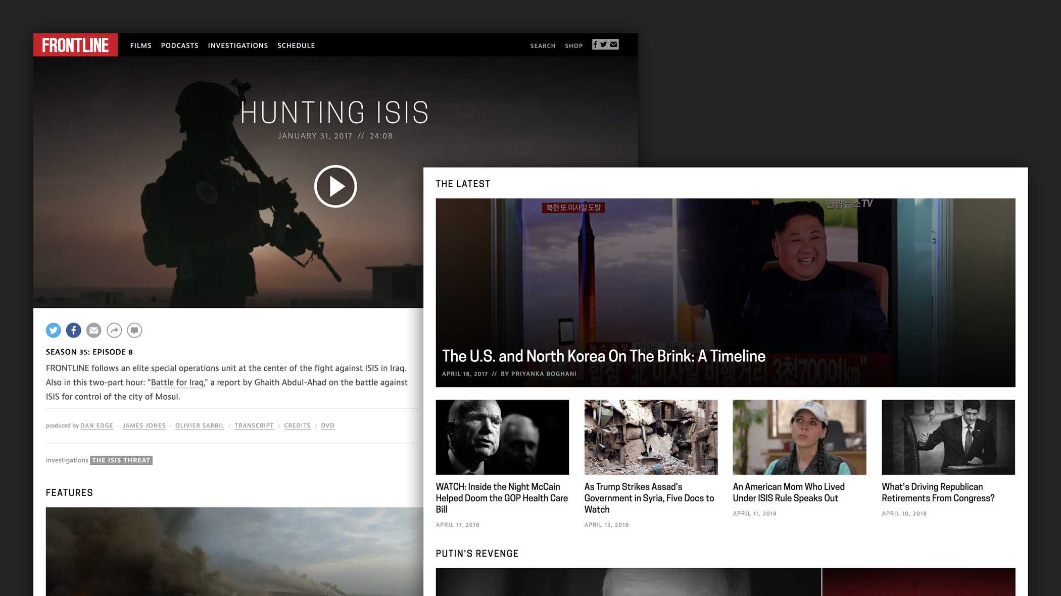
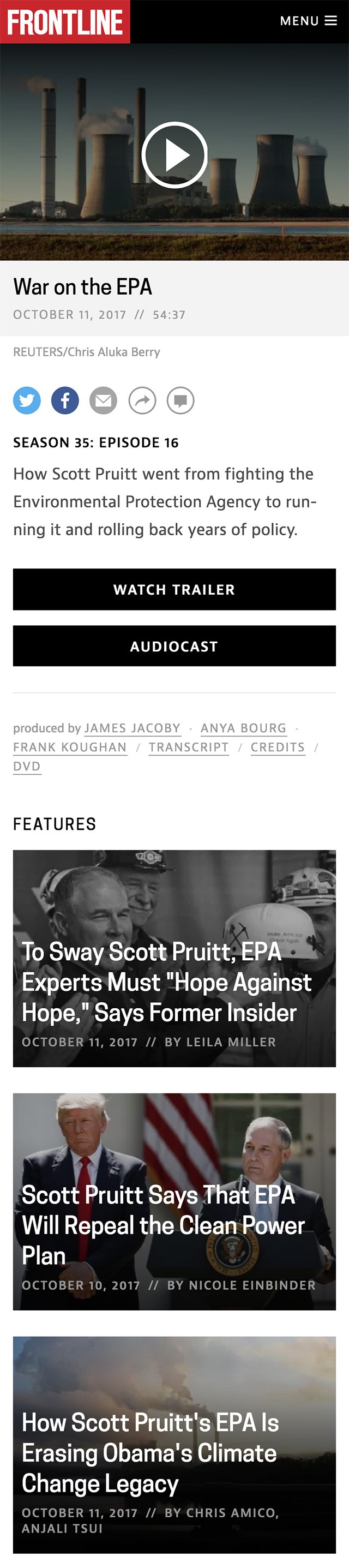
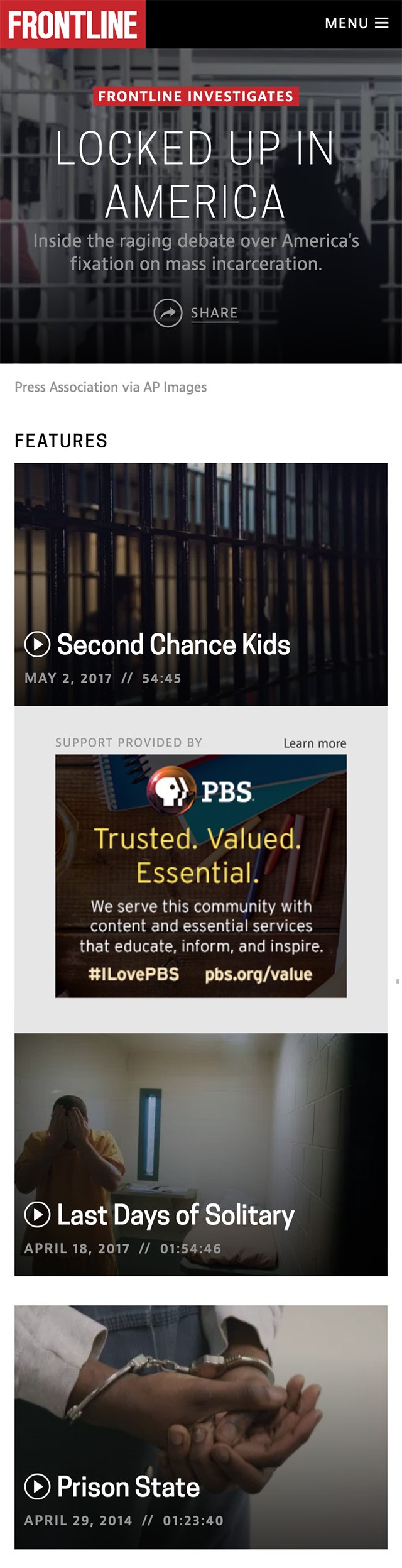
This component based design process formed the structure of the site. It allowed the final development of the site templates to move forward with more confidence. Here are two of the key pages that took shape:
The film page is where visitors can watch a documentary and explore related stories.

An investigation is a collection of curated content around a topic that FRONTLINE is pursuing.

After we launched this redesign at the end of 2015, I ended up leaving my job at WGBH Digital and joining the FRONTLINE team full time. I've been working with this design system I created for the last two years. I've been able to test it’s flexibility on new site features and expand the brand and system to fit new editorial experiences.