Project:
FRONTLINE Website Redesign 2025
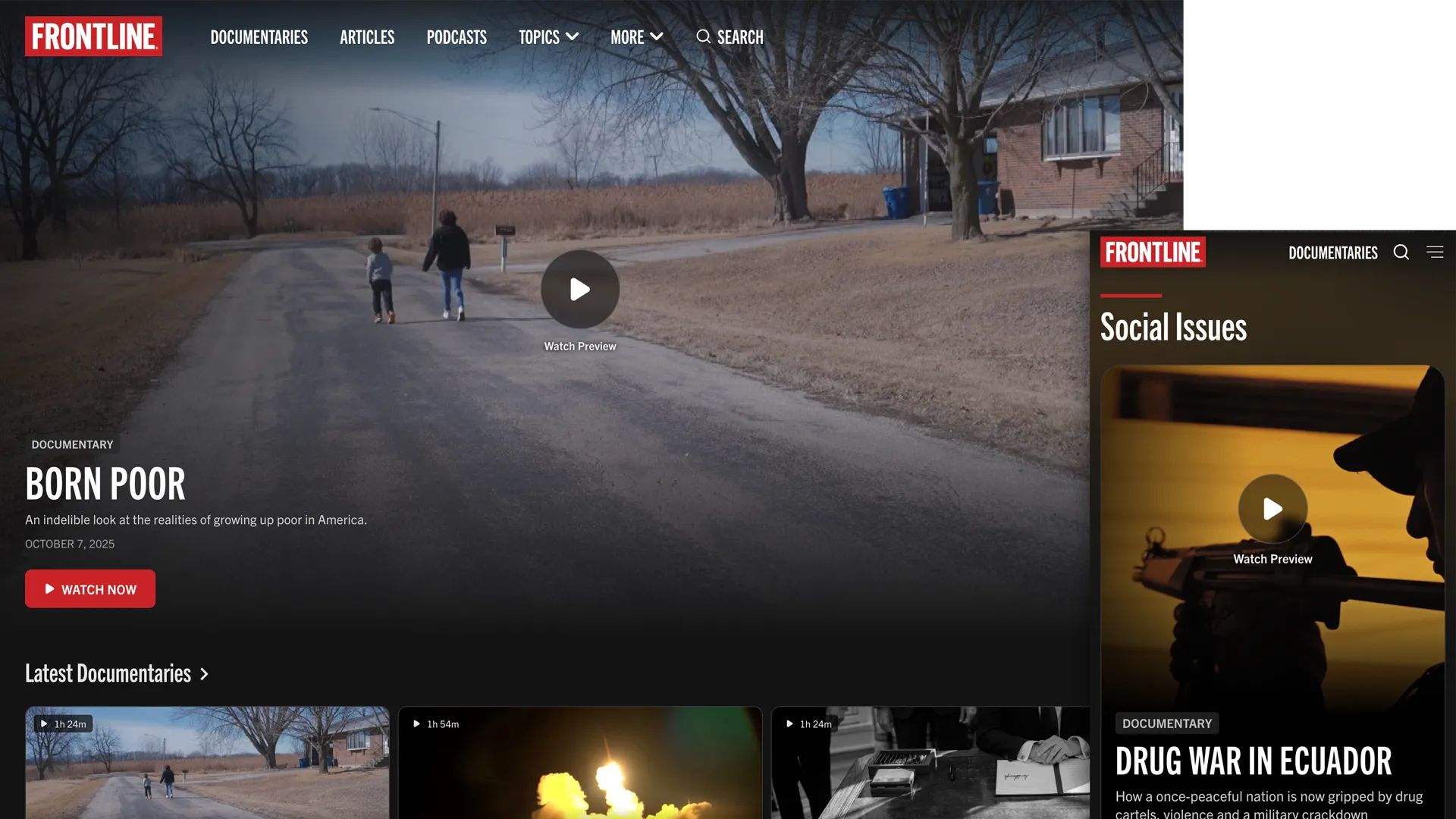
A project years in the making, the redesign of the FRONTLINE website launched in the fall of 2025. I led the design direction and set the project’s strategy, schedule and milestones, working through discovery and prototyping and overseeing the execution of the visual design, in collaboration with GBH’s product design and technology teams. Our goal was to refocus the site as a streaming destination and make it easier to browse and discover our archive of over 300 documentaries, free to stream. We also wanted to make FRONTLINE’s topics and storytelling formats more obvious and findable.
Discovery
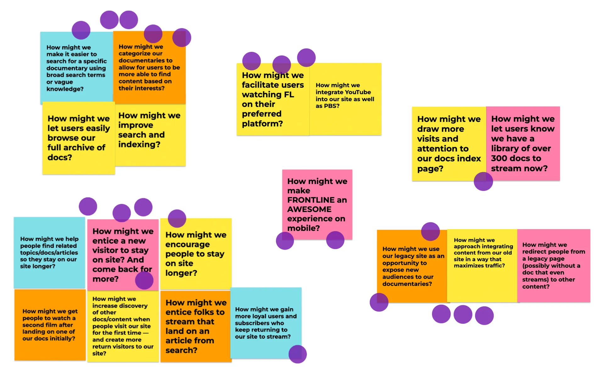
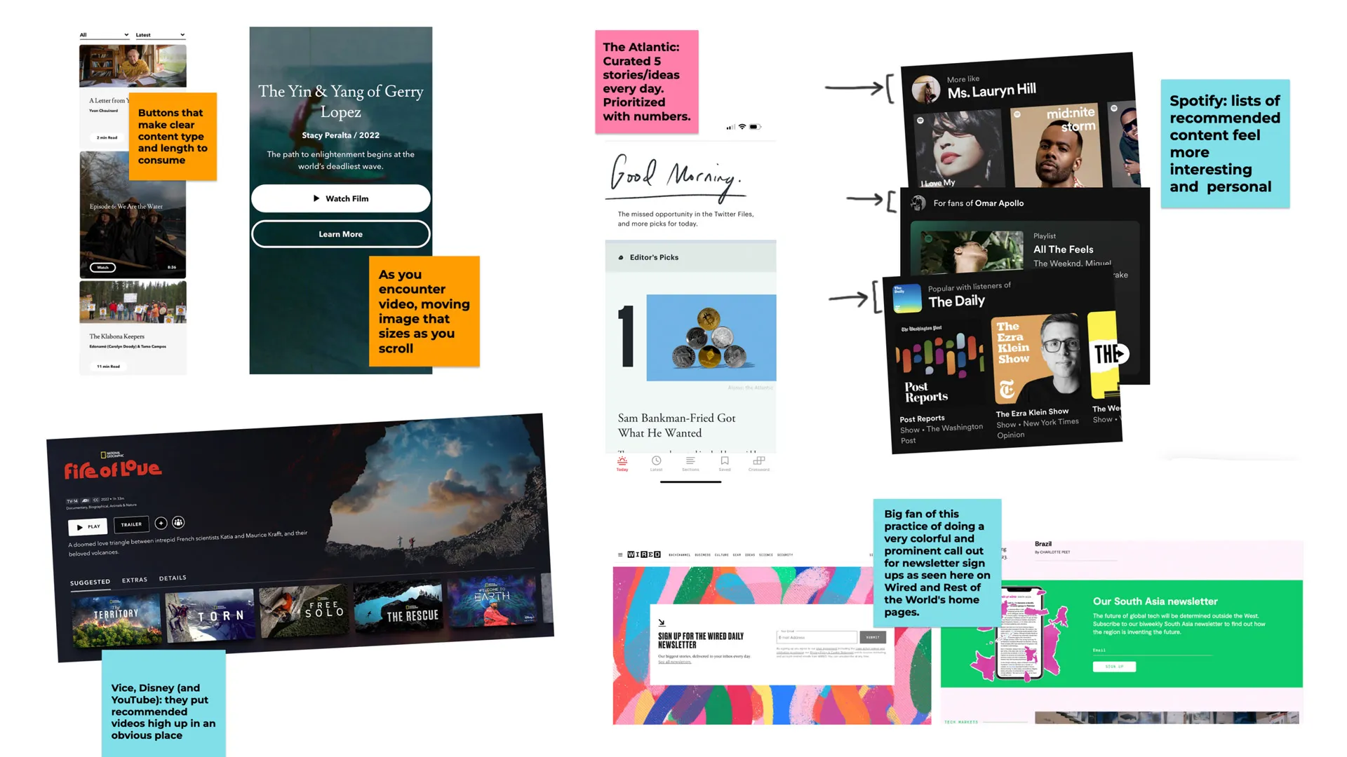
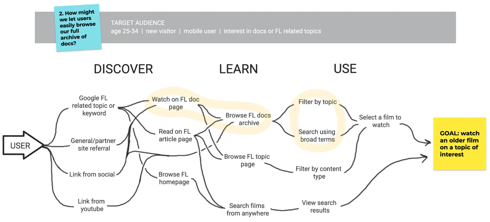
I led the team through a discovery phase, starting with a review of site analytics to surface challenges and opportunities and help narrow down our target audiences. From there I ran a How Might We exercise to zero in on the goals and opportunities the team felt were most important, and I suggested lightning demos as a more active way to do competitive research.
I then moved the team through journey mapping based on the goals from our How Might We session and our target audiences. We traced the user’s path from a discovery entry point through to a specific goal. This helped us identify high-impact points along that path: key pages and features that needed the most attention, and the clearest opportunities for prototyping.
Prototyping & User Testing
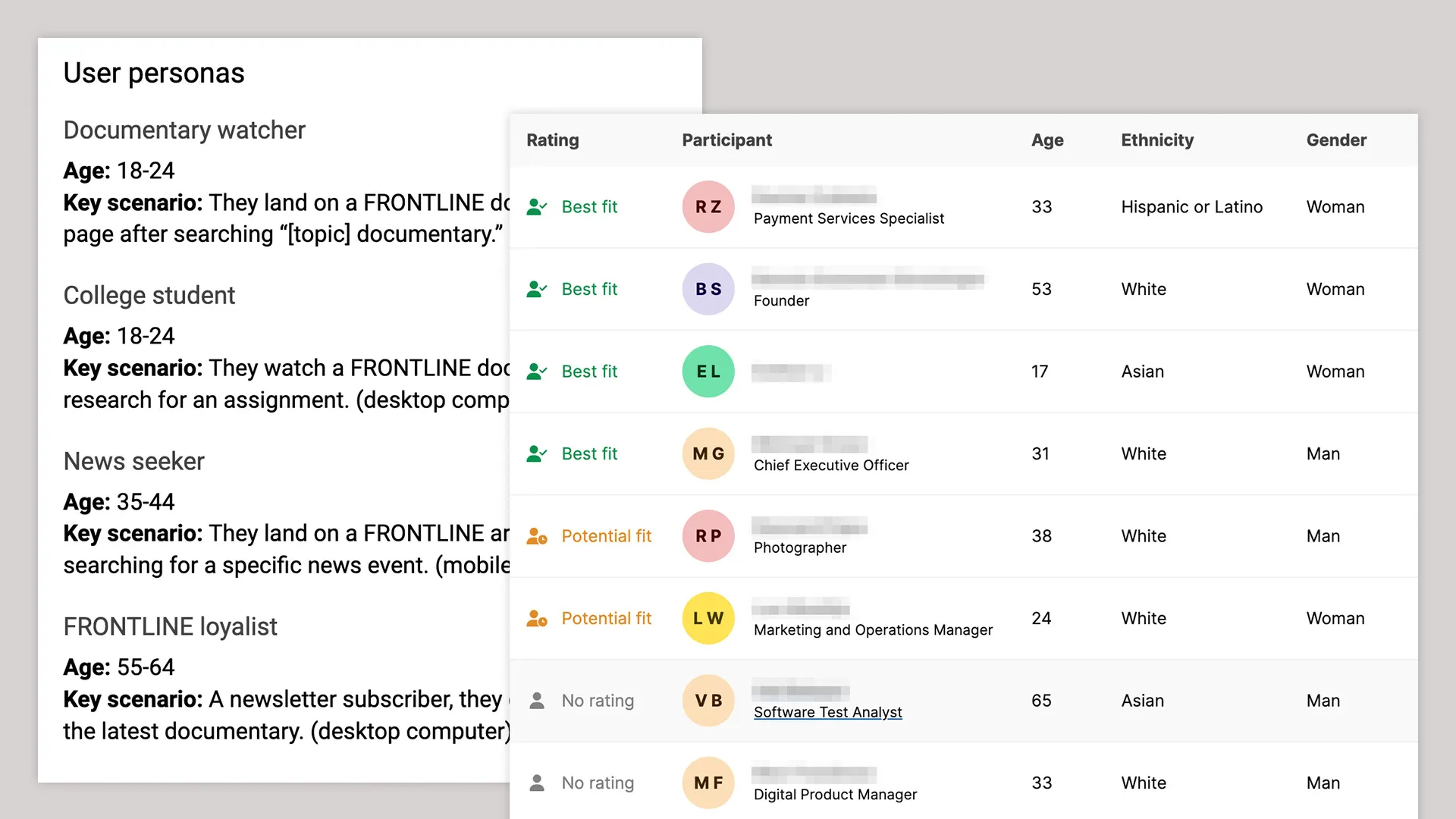
Discovery surfaced the key questions we needed to answer and helped us identify high-impact features to test. I worked with an internal UX team to build prototypes that would answer these questions, and brought in the User Interviews platform so we could recruit test subjects who matched our target audiences by interest and demographic.
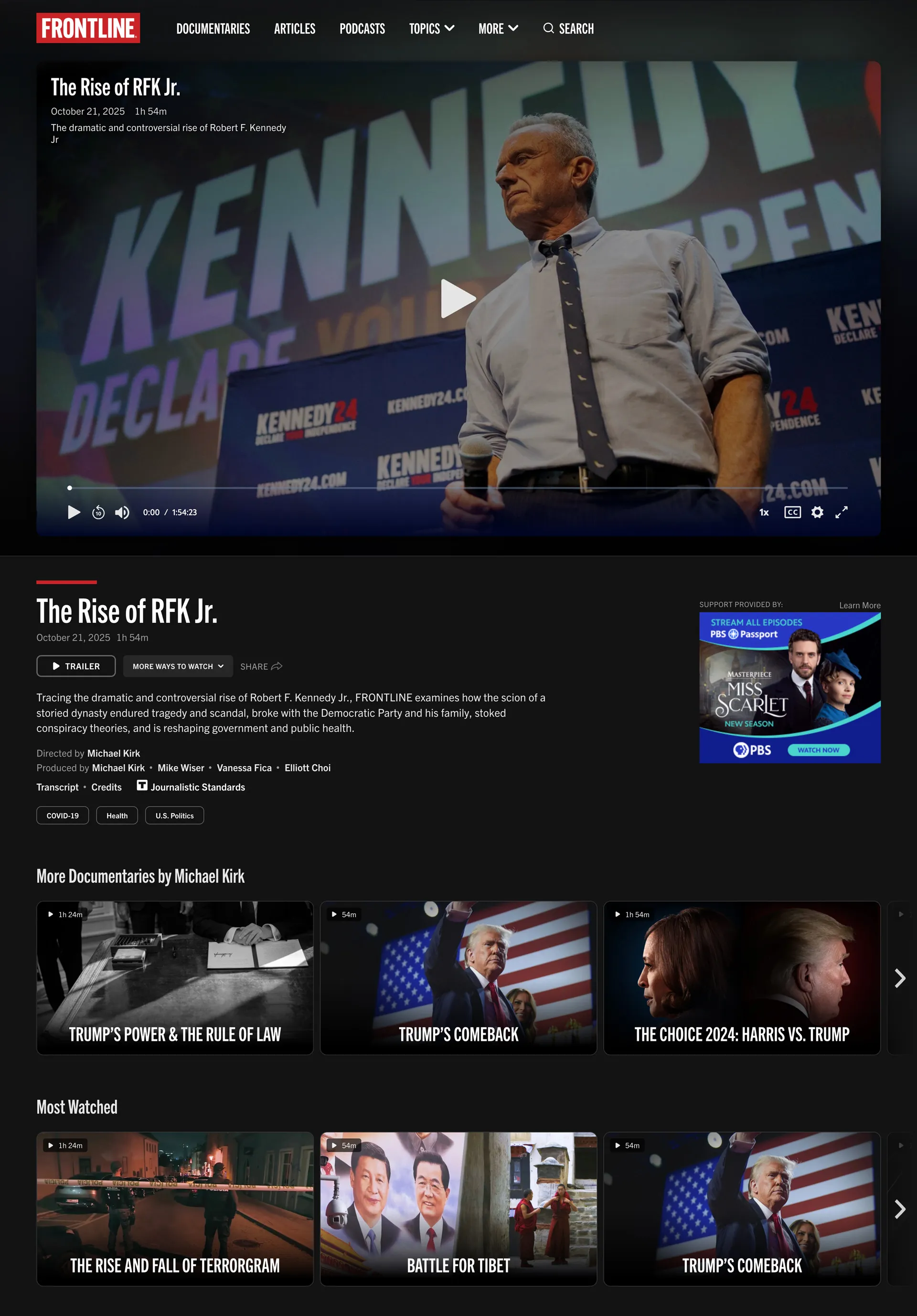
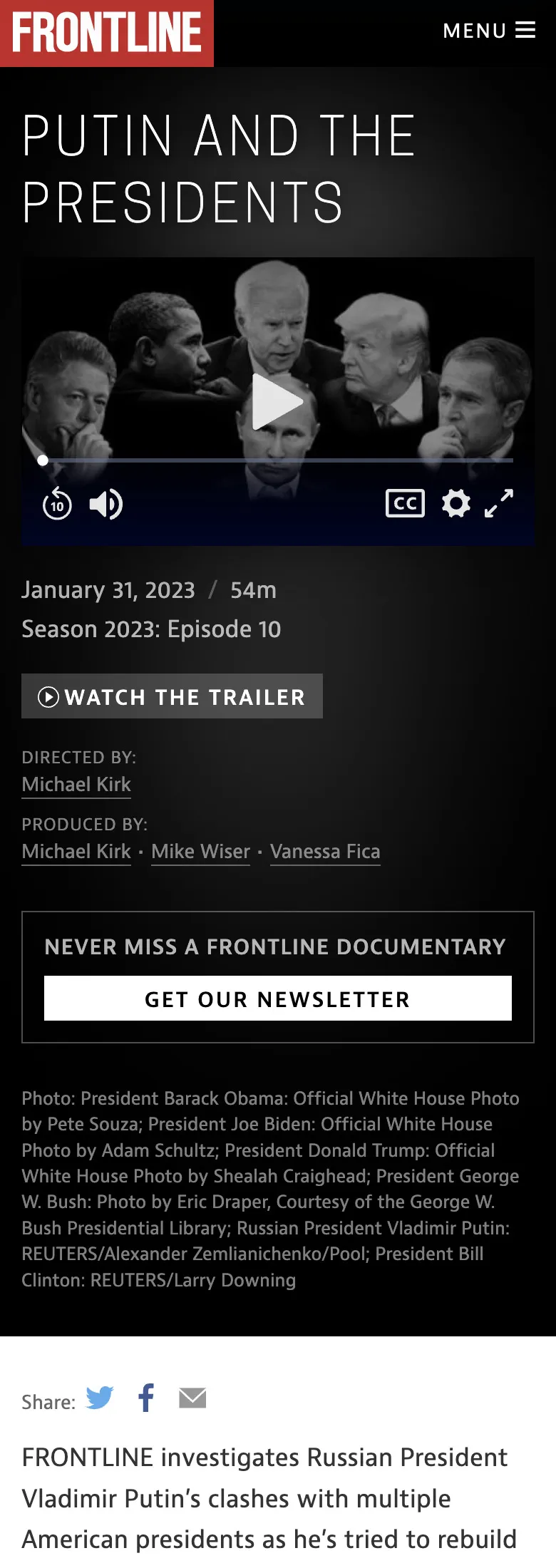
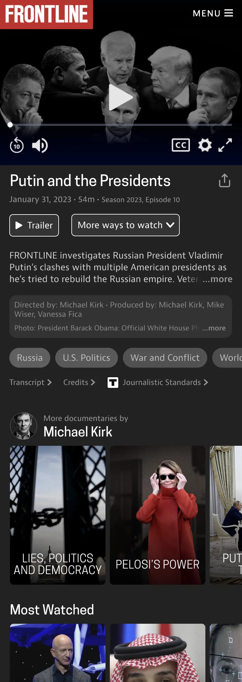
The documentary page was our most important template — the page where the film is actually watched, and one of our highest-traffic pages. It was also an opportunity to increase engagement by recommending more documentaries in a better way. In this prototype, we prioritized the video at the top and added new related documentary sliders. Then we tested the new design against the existing page. One test participant said of the new version that they felt “more prompted to try more content.” A new feature surfaced more films by the same filmmaker. And another tester said they were “drawn to more documentaries by Michael Kirk.”
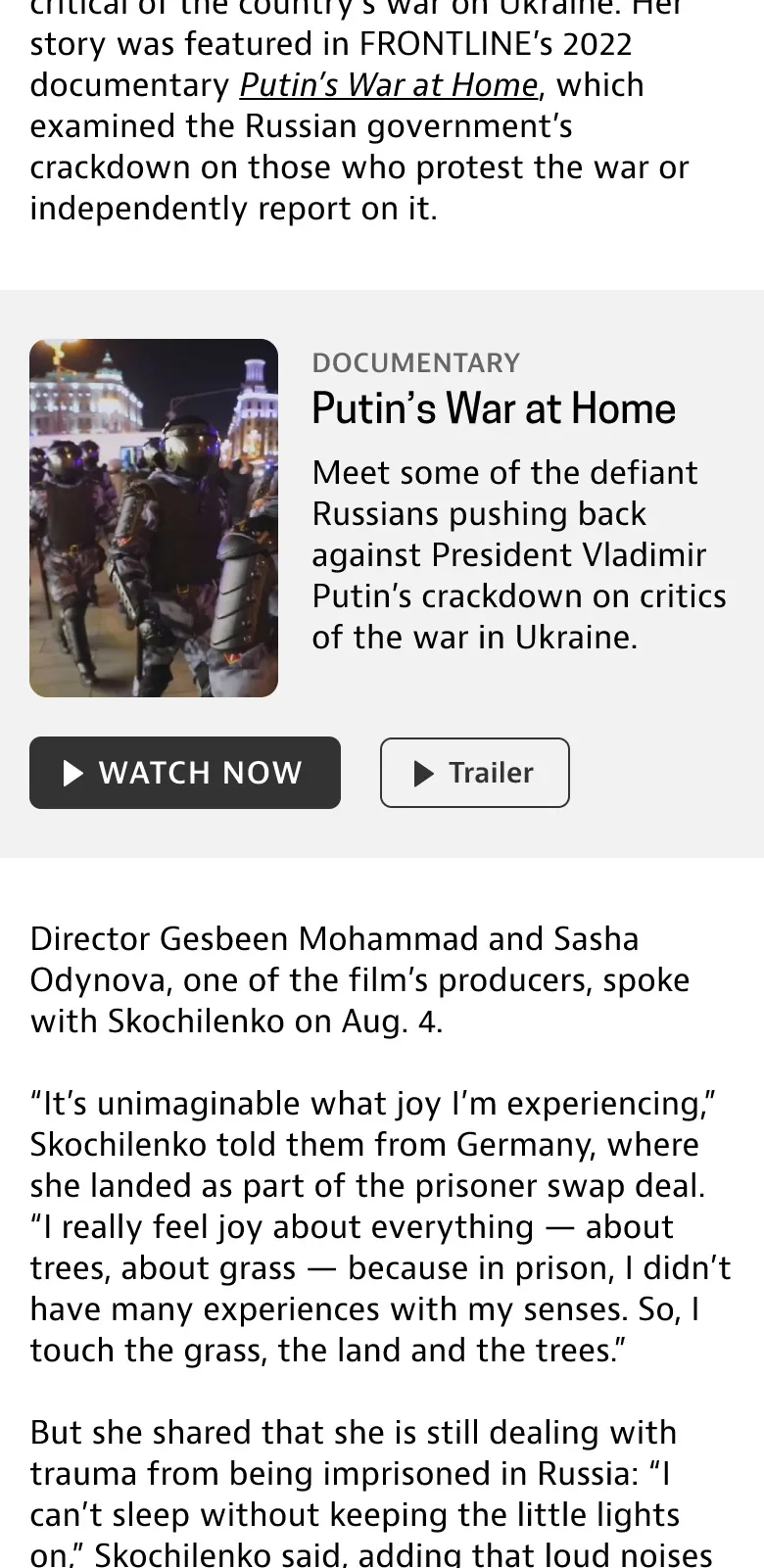
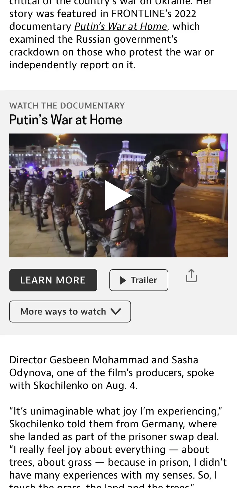
On the article page, we wanted clearer pathways from an article to watching a related documentary, so we prototyped and tested two inline component variations. The version with an embedded video player was the clear winner.
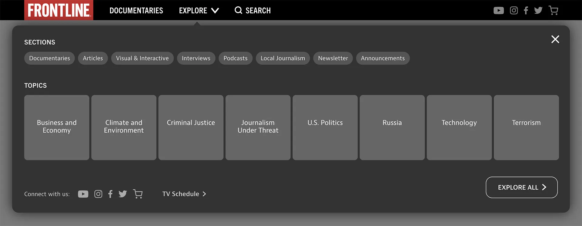
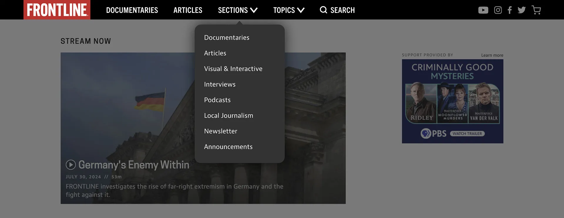
For the global nav, we wanted content types and topics to be more obvious and findable, so we tested two UI variations. Nearly all test participants preferred the version with two smaller dropdowns, and one called it “clean and organized.”
Structuring the Site
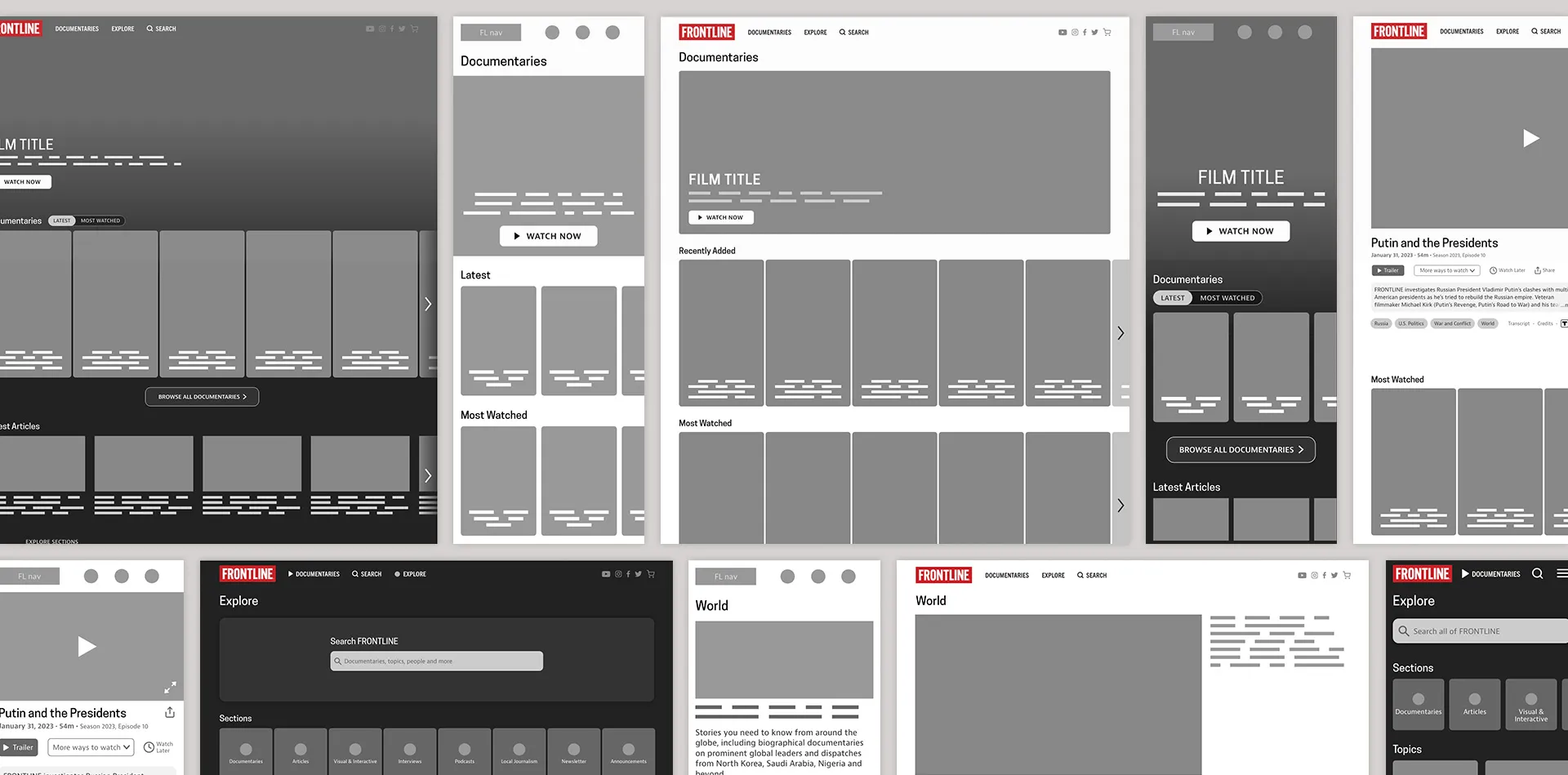
Wireframes are where most of the important design decisions get made, and those decisions carry through into the visual design stage. I built out wireframes for the site’s key page templates. My decisions were driven by the structural and layout improvements identified during our discovery phase and informed by what we learned from user testing.
Visual Design
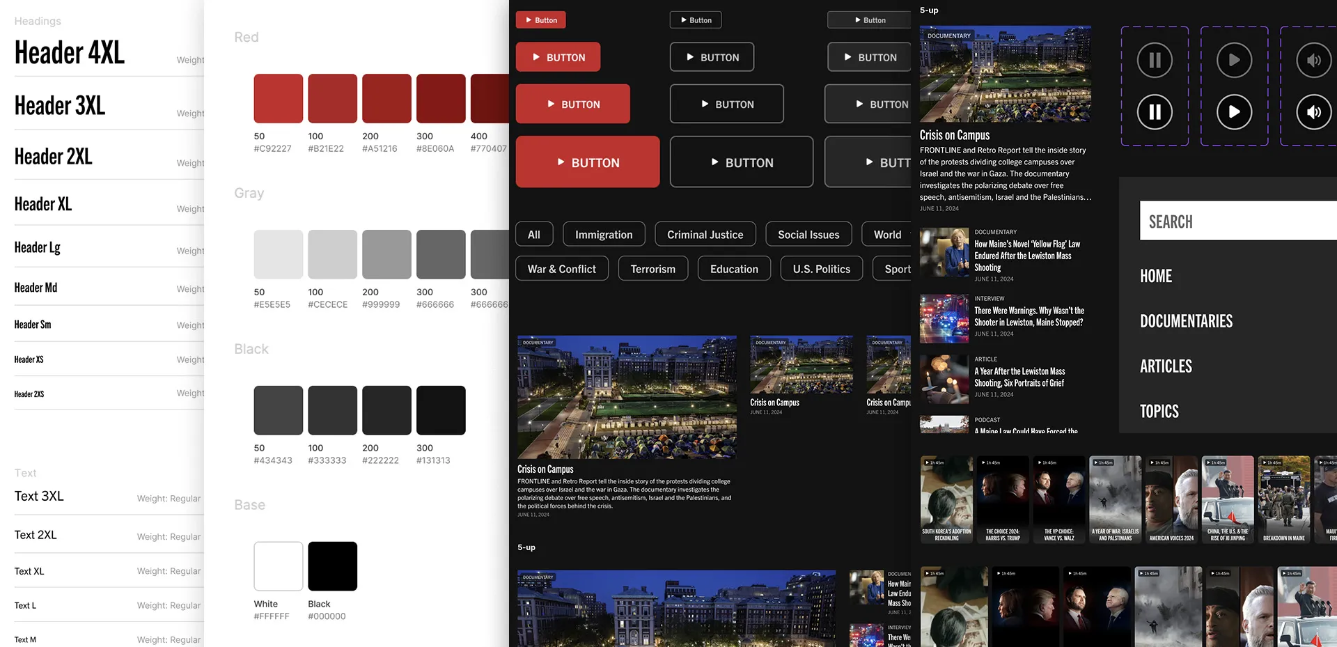
I collaborated with an internal product design team, overseeing and directing a senior designer who built out page comps and a full design system based on the wireframes and a recently revamped FRONTLINE brand guide.
Building & Polish
Working with our development team, I leaned into the front end code to add final polish, making sure typography and spacing throughout the site matched our standards. The final site reflects the goals that were established during the discovery phase.
The homepage repositions FRONTLINE as a streaming documentary destination, leading with rich, visual journalism and the latest films.
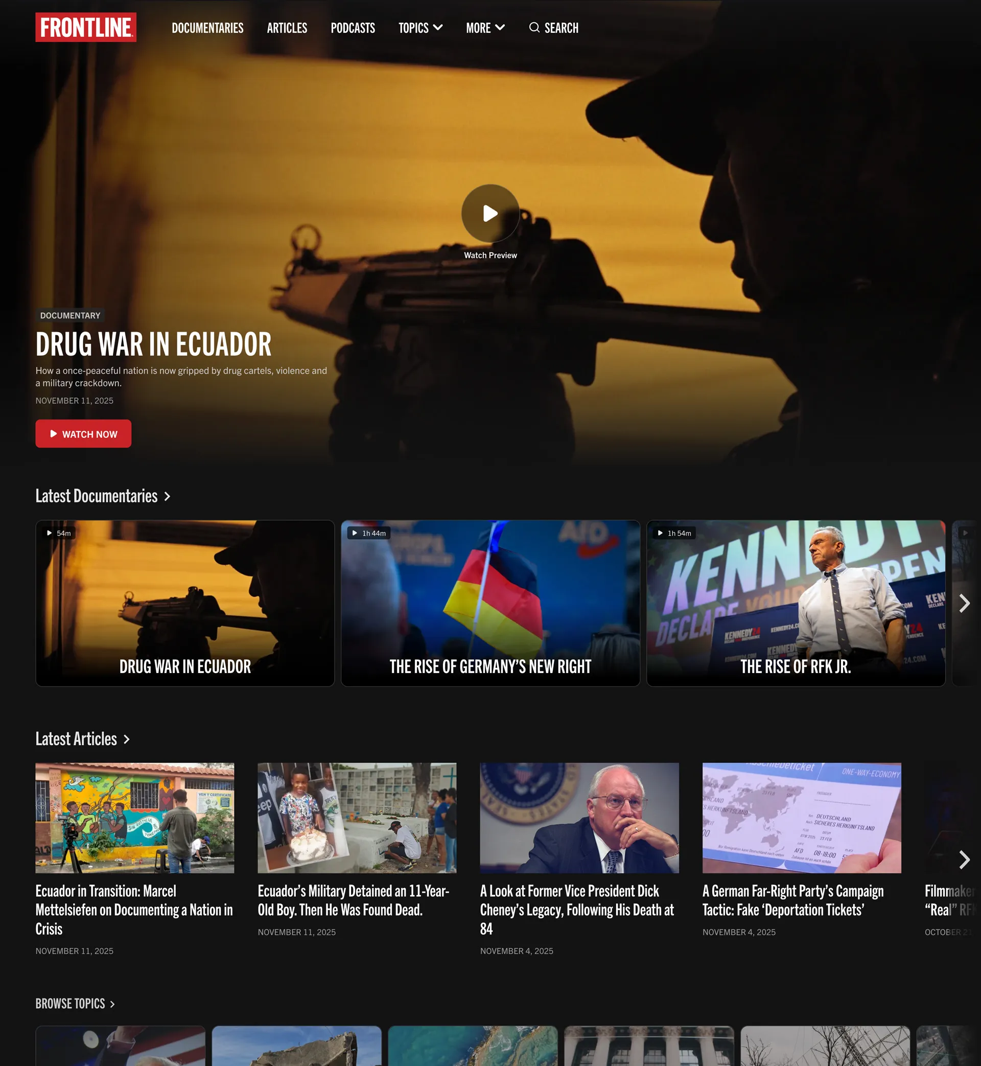
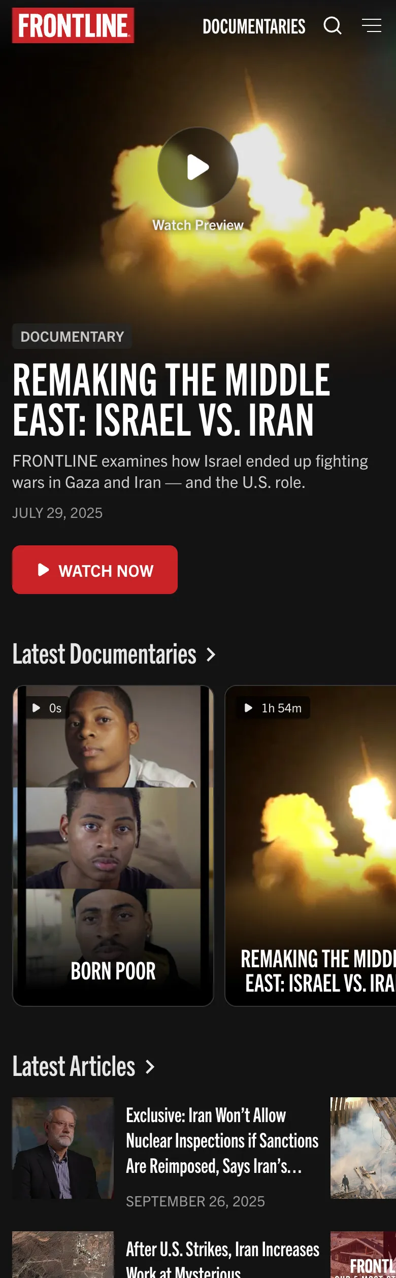
The documentaries index is organized by topic to encourage discovery of the full archive, another feature confirmed during user testing.
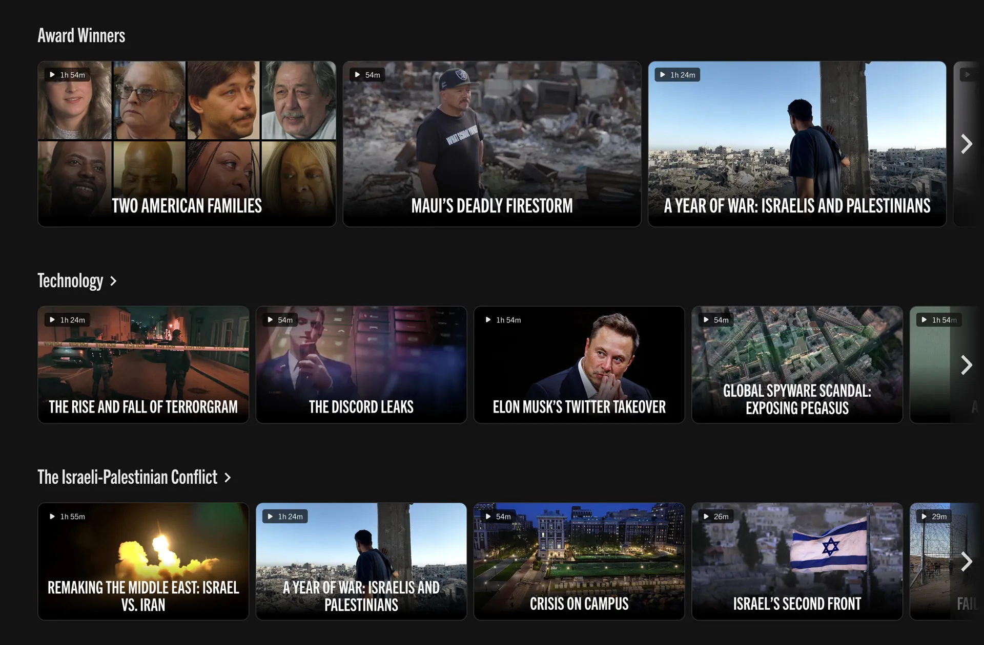
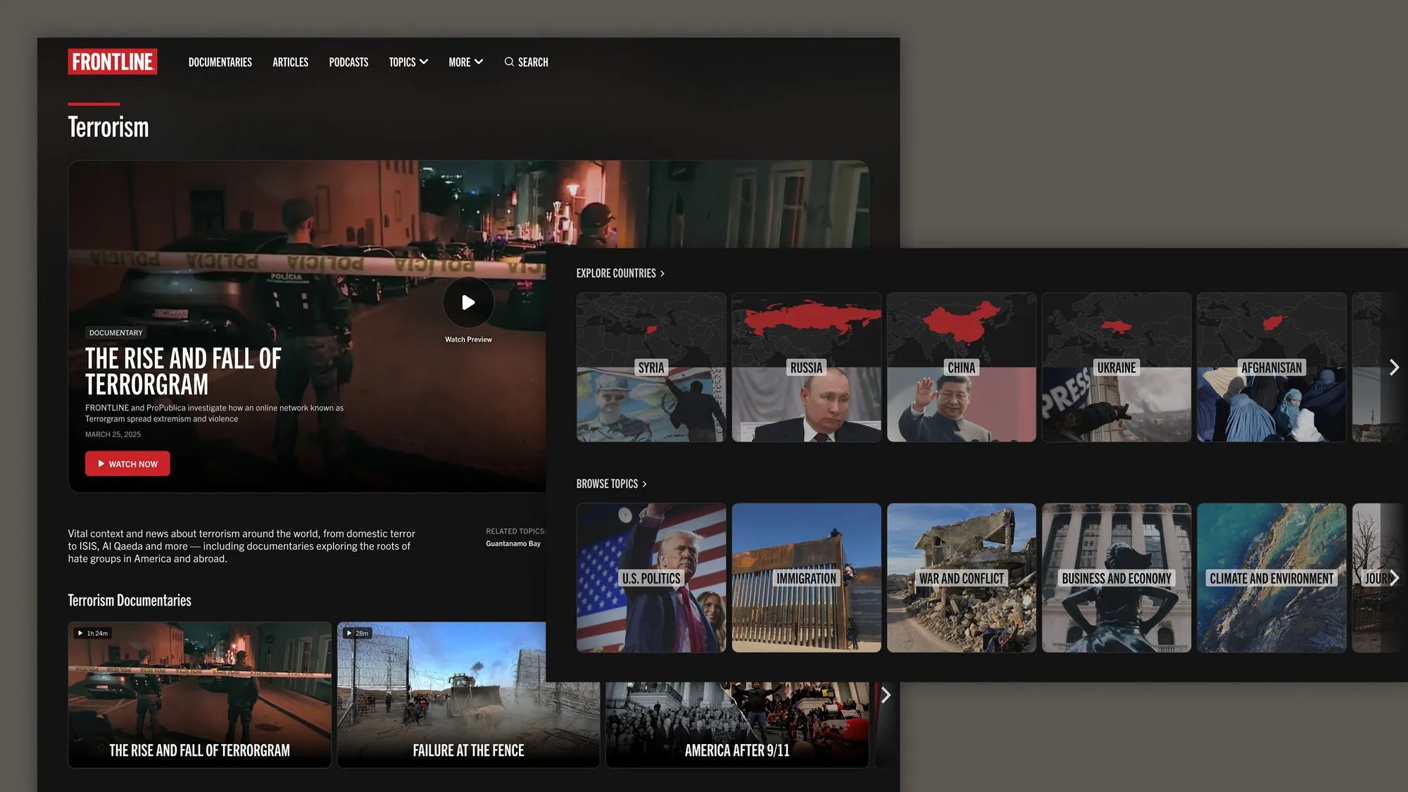
And browsing and filtering by topic plays a deeper role throughout the site, where topics are more upfront and featured.
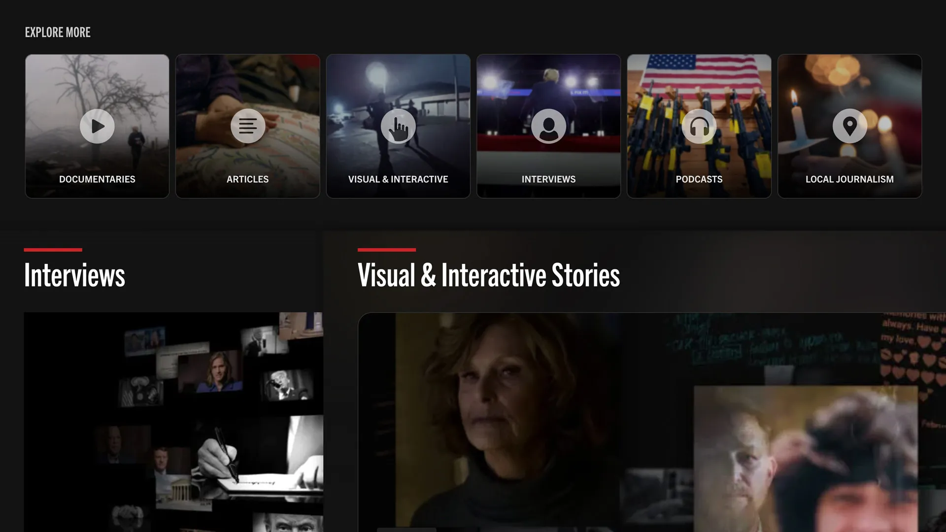
The site is organized around all of FRONTLINE’s content — articles, interviews, interactives, podcasts and local journalism — not just documentaries.
Throughout, clearer pathways lead visitors from our highest-traffic pages toward more documentaries to watch next.